7 Front Door Colors That Instantly Lift Your Curb Appeal
Real-estate agents say buyers decide in the first eight seconds — and those seconds happen at the curb. The good news: the highest-impact upgrade costs a quart of paint and a weekend.
Pin this for later — save these front door colors for paint-store day.
The colors that consistently work
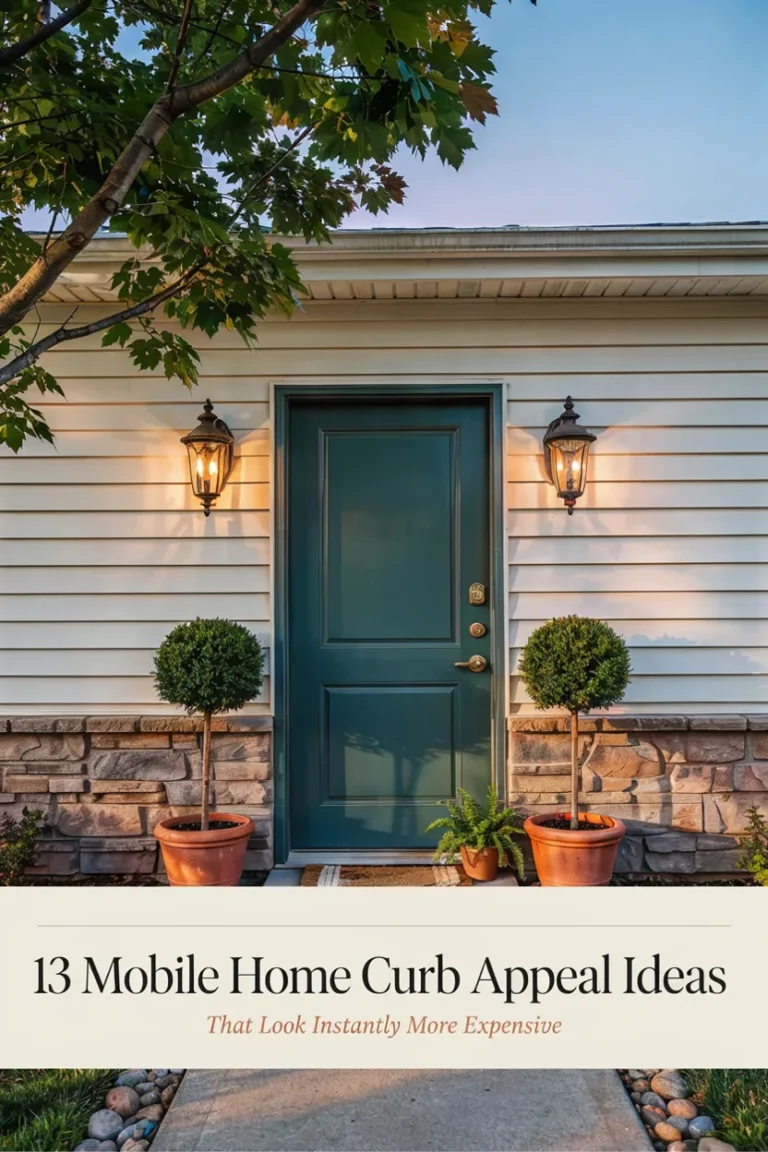
Deep olive green flatters brick, cream, and gray siding alike — earthy but polished. Soft black (charcoal, not jet) adds instant architecture to plain facades. Warm terracotta reads friendly and editorial against white or greige. Muted navy is the safest crowd-pleaser and pairs beautifully with brass hardware. Clay pink is bolder, but on stone or white cottages it photographs like a magazine cover. Butter yellow suits traditional homes with dark shutters. And greige-mushroom, the quiet one, makes minimalist exteriors look expensive.
Match the undertone, not the trend
Hold your paint chip against the fixed elements — brick, roof, walkway — in daylight. Warm-toned houses (red brick, cream siding) want warm door colors; cool-toned ones (gray, blue-toned stone) want cool. An undertone clash is why some doors look “off” no matter how trendy the color.
The details that finish the look
Repaint or replace the house numbers, swap the porch light if it’s builder-grade, and add one oversized planter — not two small ones — beside the door. These three details cost under $100 combined and do more than most landscaping projects.
Test before you commit
Paint a large swatch on cardboard and tape it to the door for three days. Look at it morning, noon, and dusk. Door colors shift dramatically with light, and this one habit prevents nearly every repaint regret.
Pin this for later — pin this before you pick up a brush.