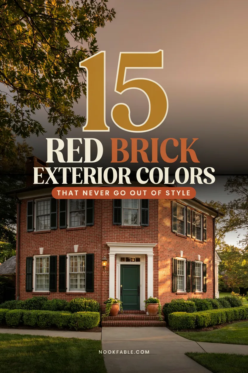
15 Red Brick House Exterior Colors That Never Go Out of Style
Red brick is the rare exterior that comes with opinions built in — warm undertones, texture, and a century of association with homes that last. The catch: brick is permanent, so every color around it has to be chosen, not defaulted. Get the trim, door, and shutter palette right and the brick glows like it was fired yesterday; get it wrong and even beautiful masonry reads dated. The good news is that red brick house exterior colors follow reliable rules, and the most beautiful schemes have stayed beautiful for decades.
1. Crisp White Trim With Black Shutters
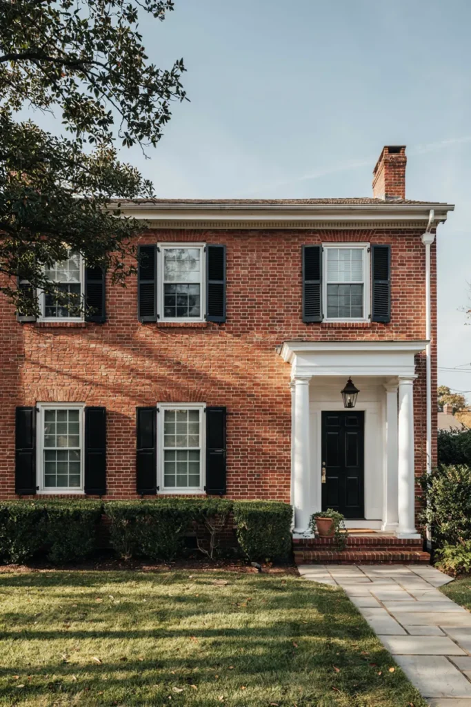
Some combinations become classics because nothing beats them: red brick, white trim, black shutters. The white sharpens every window line and makes the brick read redder and richer; the black grounds the composition like punctuation. It’s the scheme on half the most-photographed colonials in America, and it flatters brick from deep burgundy to bright orange-red without a single adjustment.
Choose a warm white — pure icy whites clash with brick’s warmth, so look to softened classics like ‘White Dove’ or ‘Alabaster’ territory. Shutters and door take a soft black or near-black, matte or satin, never glossy plastic sheen. Size shutters to actually cover the window if closed; skimpy ones betray the whole scheme. This palette also raises resale confidence like no other — it reads move-in ready from the street.
2. Warm Cream for a Softer Classic
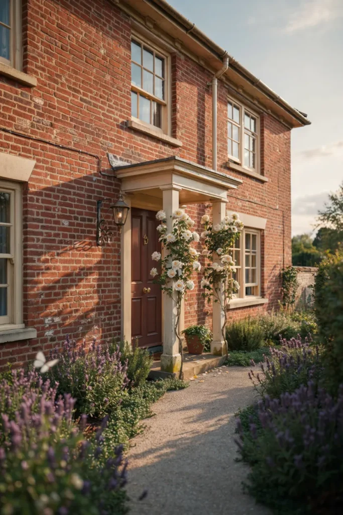
If bright white feels too crisp for your brick, cream is the gentler classic. Warm ivory trim blends with red brick’s undertones instead of contrasting them, producing a softer, older-money look — English cottage rather than Georgian formal. Orange-leaning brick especially loves cream, which quiets the orange while white would amplify it. The whole house seems to relax by two degrees.
Test creams carefully against your mortar color; if mortar is bright white, a cream trim can read dingy beside it, so lean slightly whiter. Pair with earthy accents — bronze, chocolate, or olive doors — rather than black, which fights cream’s softness. Copper light fixtures age into the palette perfectly. This is the scheme for gardens, roses, and homes that want to look like they’ve always been there.
3. Sage Green That Makes Brick Bloom
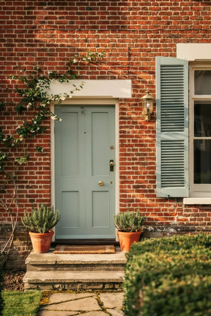
Green and red sit opposite each other on the color wheel, which is why sage works near-magic on brick: the muted green makes red masonry look more alive, the way foliage flatters roses. Unlike trendier brights, sage carries a botanical calm that has moved through decades of style without dating. A sage door and shutters against warm white trim is currently the most-saved brick scheme on Pinterest — for durable reasons.
Keep the sage genuinely muted — gray-green rather than minty — since clean pastels turn candy-like against brick. Repeat the tone at least twice: door plus shutters, or door plus porch ceiling in the Southern tradition. Brass hardware and terracotta pots complete the palette’s warmth. Sage suits every brick shade but especially loves the darker, browner blends that black would render gloomy.
4. Navy Blue, the Confident Classic
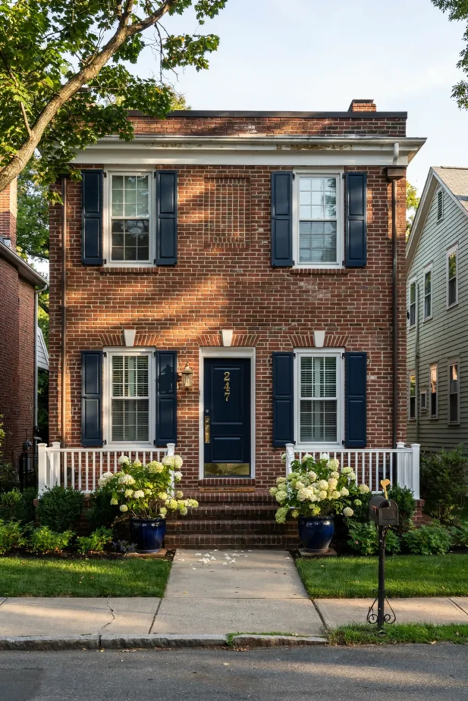
Navy against red brick is the scheme that always looks slightly more expensive than it cost. The deep blue reads as formal as black but friendlier, and it flatters brick’s warmth the way a navy blazer flatters everything. It’s coastal without theme-park nautical, traditional without stuffiness — which explains why realtors quietly recommend it more than any color except white trim itself.
Go genuinely deep — near-midnight navies hold their dignity while brighter royals turn primary-school against red. White or soft-white trim is the mandatory partner; cream muddies navy. Brass or polished nickel hardware both work, and white hydrangeas in navy planters are the scheme’s signature flourish. If shutters feel like too much commitment, a navy door alone delivers most of the payoff.
5. Black Window Frames, No Shutters at All
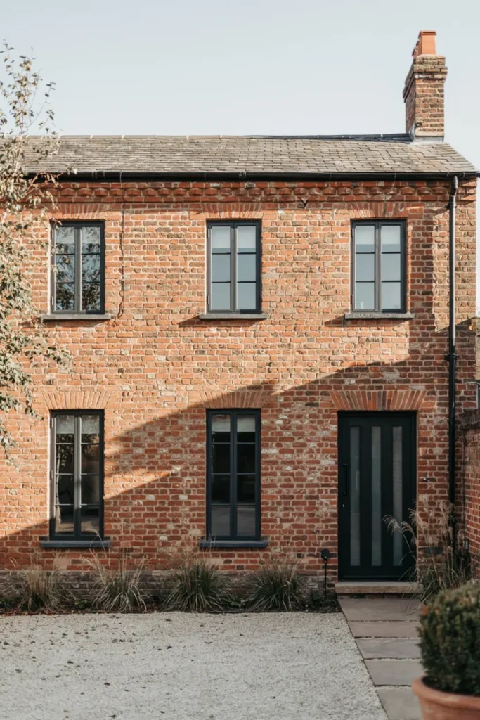
Deleting the shutters is the boldest move on this list — and the most transformative for brick homes seeking a current edge. Matte black window frames against clean red masonry is the language of warehouse conversions and high-end renovations: the brick supplies history, the black steel supplies now. The house reads architectural rather than decorated, and suddenly the 1940s brick looks like a design decision.
Commit fully: frames, gutters, downspouts, and door all in the same soft black, because one white gutter breaks the spell. Repoint tired mortar first — this scheme showcases brickwork mercilessly. Landscaping should follow the modern brief: grasses, gravel, structural evergreens, no foundation ruffles. Works best on simple, strong-lined houses; ornate Victorians want their shutters back.
6. Greige Siding for the Two-Material Loo

Many brick homes aren’t all brick — gables, additions, and second stories often carry siding that someone painted whatever was on sale. Treating that siding as a deliberate second material in warm greige modernizes the entire house: the gray-beige bridges brick’s warmth and current tastes, letting masonry and siding read as a composed pair rather than an argument. It’s the renovation look without the renovation.
Choose greige with the same undertone temperature as your brick — warm brick wants warmer greige; test large swatches at the actual junction. Keep trim consistent around both materials, white or matching-greige for the seamless modern read. A walnut or black door anchors the meeting point. Where brick meets siding at a floor line, a slim painted band board makes the transition intentional.
7. Oxblood Tone-on-Tone Drama
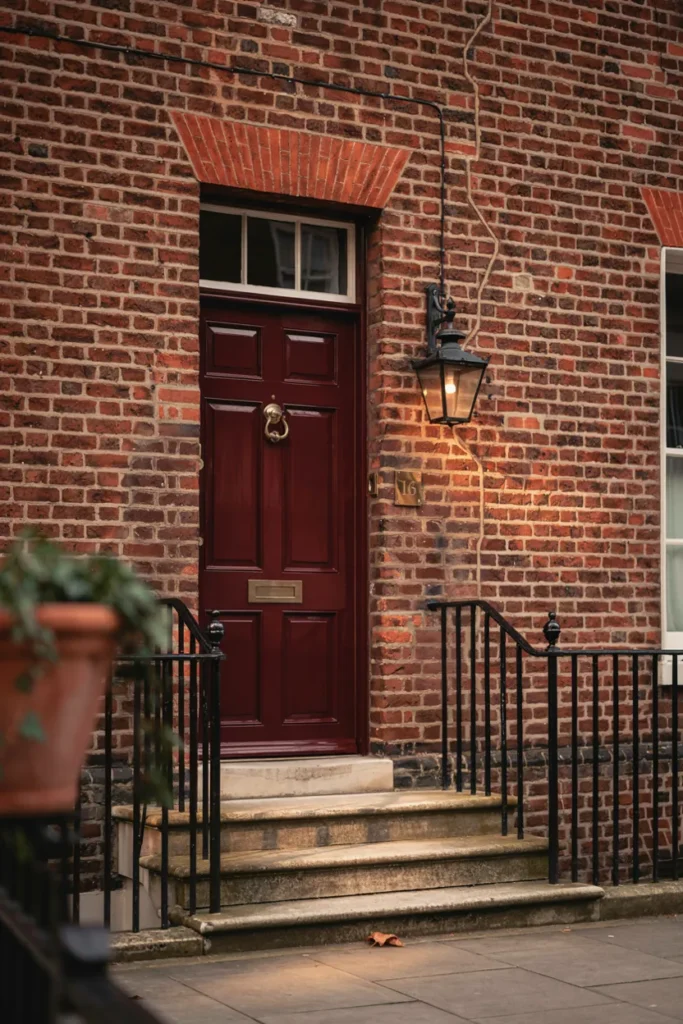
The daring version of matching: a door in deep oxblood or burgundy, two shades darker than the brick itself. Tone-on-tone reads as high fashion applied to architecture — richer than contrast, quietly confident, the exterior equivalent of monochrome dressing. London townhouses have run this play for two centuries, and it makes even modest brick facades feel like they have a wine cellar.
The door must go clearly darker than the brick — matching too closely looks like an accident. Satin or soft-gloss finish gives the depth this scheme trades on. Keep trim quiet (soft white or stone) and hardware aged brass, never chrome. Black ironwork and a gas-style lantern complete the look. One rule: tone-on-tone rewards well-kept brick, so wash the facade before committing.
8. Olive and Bronze, the Earthy Underdog
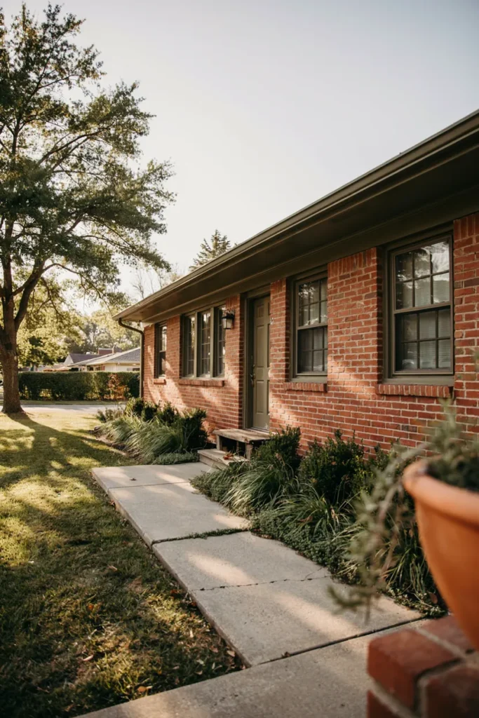
Olive is the scheme nobody expects and everybody compliments. Deeper and browner than sage, it pulls red brick toward the landscape — house and ground reading as one earthy composition, especially on ranches and mid-century homes where nature-adjacent palettes were the original intent. Against orange-red brick, olive performs the same flattery as sage but with more gravity and none of the trend anxiety.
Use olive on trim and fascia rather than just the door for the full effect; this is a scheme that rewards commitment. Bronze window frames or dark taupe accents deepen it further. Skip white entirely — stone, tan, or the brick’s own mortar tone handle the lighter notes. Landscaping leans native and textural. The result photographs like an architecture magazine’s ‘before they were famous’ feature.
9. Soft Black Door With Copper Accents
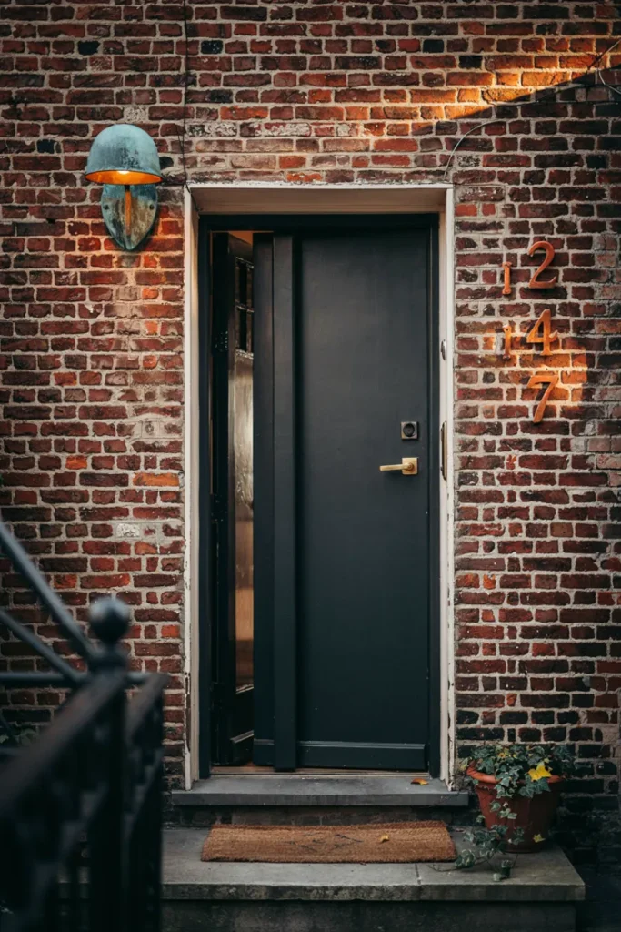
Black doors are everywhere; black doors with copper are remembered. The warm metal — light fixture, house numbers, mail slot — bridges the coolness of black and the warmth of brick, and unlike brass, copper keeps improving, patinating from bright penny to soft brown-green over years. It’s a small-budget scheme with jewelry logic: neutral outfit, exceptional accessories.
Choose a soft black with warmth in it rather than jet, satin finish. Then let copper carry every metal moment: sconce, numbers, kickplate if you like. Raw copper patinas naturally; lacquered stays bright — pick one philosophy and match across pieces. White or stone trim keeps the frame quiet. Total cost often lands under three hundred dollars, which per compliment makes it the value leader here.
10. Charcoal Roof, the Fifth Wall Done Right
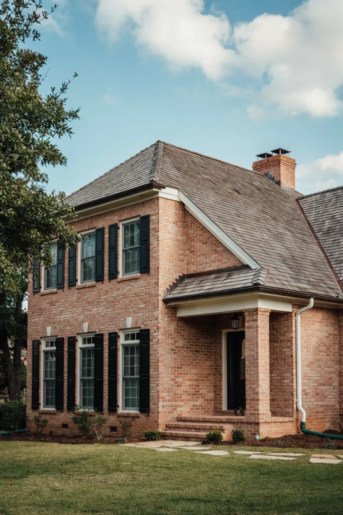
Roofs cover a third of what the street sees, yet they’re chosen last and cheapest. On red brick, charcoal is the never-wrong answer: deep neutral gray that lets the masonry glow warm while brown roofs muddy it and light roofs wash it out. When replacement time comes, that one decision recolors the entire house — the fifth wall finally agreeing with the other four.
Architectural shingles in charcoal or weathered-wood-gray blends suit every brick tone; avoid roofs with red or rust flecks that compete with the masonry. If replacement is years away, work with what exists — brown roofs steer the palette toward creams and olives, gray roofs open every option. Copper or black gutters finish the edge. Photograph your house from the street before deciding anything; the roof’s share of the frame surprises everyone.
11. Forest Green and Brass, Quietly Grand
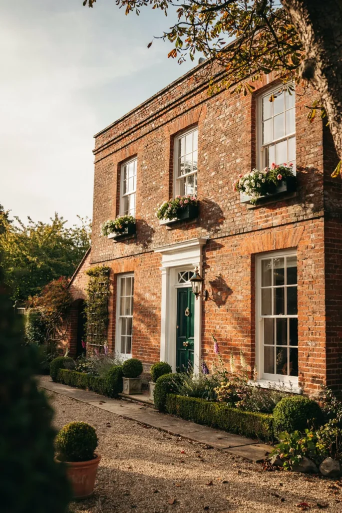
Forest green is sage’s formal older sibling — the color of library walls and university doors, and red brick’s most aristocratic partner. Deep green with polished brass against warm masonry reads establishment in the best sense: permanent, cared-for, faintly literary. Where navy says coastal and black says modern, forest green says this house has always known exactly what it is.
Depth is everything: hunter and bottle greens carry the gravitas that brighter greens lose instantly. Brass hardware isn’t optional here — it’s the scheme’s second color, so polish or replace mismatched pieces. White trim for contrast, or stone tones for softer age. Window boxes in the same green, planted white and trailing, complete the collegiate postcard. Ivy optional but thematically correct.
12. The Limewash Softening
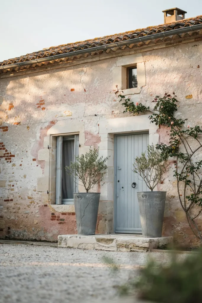
Sometimes the timeless move is changing the brick itself — gently. Limewash coats masonry in a mineral veil that lets texture and whispers of red show through, aging into the softly weathered look of European farmhouses. Unlike paint, it’s breathable and erodes gracefully rather than peeling, and it can be partially scrubbed back for the perfectly imperfect finish designers chase.
This is a one-way romance — fully reversing limewash is miserable work — so test a hidden section and live with it for a month. Authentic mineral limewash only, never latex ‘limewash-look’ paint that seals the brick. Pair the softened facade with muted doors: gray-blue, putty, sage. Zinc, stone, and olive trees complete the Provence transfer. Best for orange-heavy or mismatched brick that never quite worked raw.
13. Dusty Blue-Gray for Cottage Calm
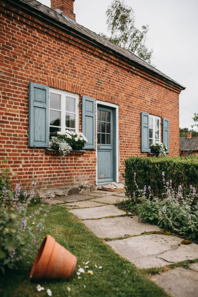
Between bold navy and trendy pastels lives dusty blue-gray — the chalky, faded blue of Swedish cottages and old French shutters. Against red brick it performs a gentle magic: cooling the masonry’s heat without fighting it, reading weathered-in rather than newly decided. It’s the palette for homes that want charm over drama, and it pairs with gardens better than nearly any other accent.
The gray content is the safeguard — blues without it turn baby-blue against brick. Test at the shady side of the house too; dusty blues shift notably between sun and shade. White trim, silver-foliage planting, and weathered zinc or galvanized accents extend the softness. This scheme flatters older, variegated brick especially, where crisp modern palettes can feel like a costume.
14. Natural Wood Against the Masonry
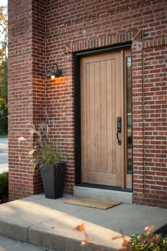
Wood is the accent brick never expected and immediately loves. A natural white oak or walnut-toned door — grain visible, finish matte — brings organic warmth that paint can’t replicate, splitting the difference between brick’s tradition and current Scandinavian-modern taste. One wooden door against masonry, framed in black steel details, and the house lands on the right side of every design decade since 1950.
Real wood demands marine-grade finish and a sheltered entry, or choose the excellent fiberglass wood-look doors that laugh at weather. Keep the wood mid-toned — honey to walnut — since near-orange stains merge into the brick. Black hardware and sconces frame it; a single oversized planter completes the vignette. Repeat wood once more (bench, gate, garage accent) so the door doesn’t float alone.
15. Iron Ore and Limestone, the Estate Finish
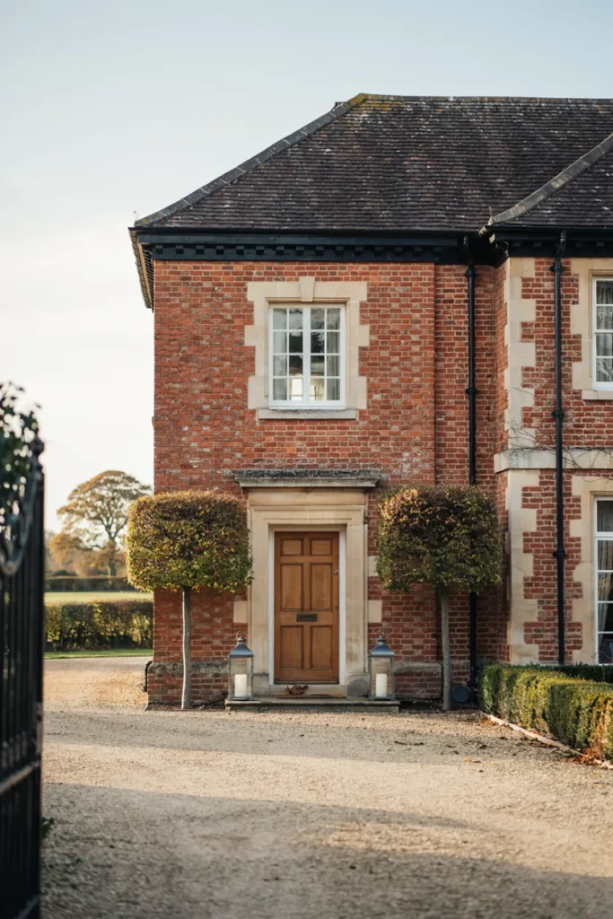
The most expensive-looking brick scheme in the world is also the oldest: dark charcoal ironwork and pale limestone details. Stone sills, a limestone door surround, deep iron-ore trim — it’s the vocabulary of embassies and estate houses, scaled down beautifully to any brick facade. The three materials cover the full value range, light to dark, which is why the composition never needs another color.
Full limestone is a mason’s project, but cast stone sills and surround kits deliver the look at renovation-budget prices — even wide, pale-painted wood surrounds gesture the same direction. Trim, gutters, and lanterns go iron-ore charcoal, one shade warmer than black. Gravel, clipped green, and symmetry finish the estate grammar. This is the scheme to grow into: add one limestone element per year and watch the house ascend.
Conclusion
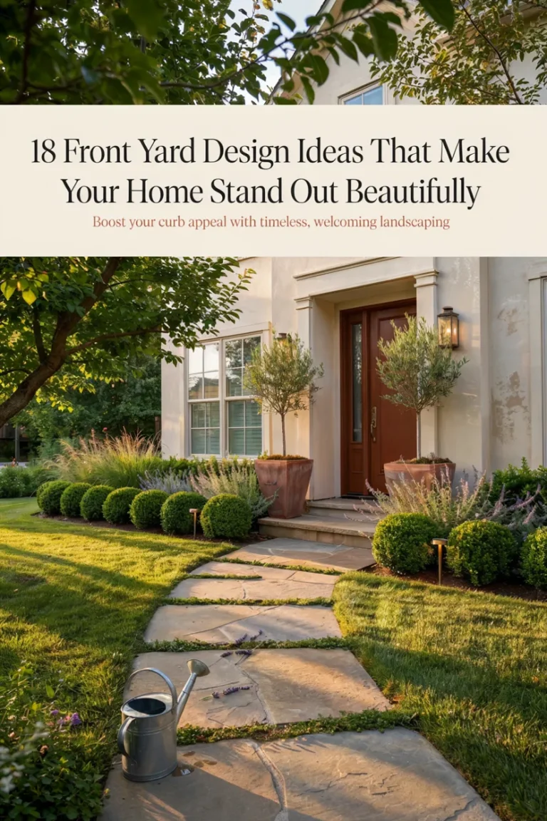
Brick already made the biggest color decision for you — everything after is a conversation with it. That’s the quiet theme running through all fifteen of these red brick house exterior colors: the schemes that never date are the ones that listen to the masonry’s undertones instead of shouting over them. Warm whites and creams sharpen it, sage and forest green make it bloom, navy and black dress it up, wood and copper warm it from beside. Before any commitment, do what designers do — tape large painted swatches beside your actual brick and watch them through a sunny day and a cloudy one, because brick shifts personality with the light. Save your favorite palettes to your Pinterest boards so the vision survives the paint-store wall of ten thousand chips. Then start with the door; it’s one gallon, one Saturday, and the fastest way to find out that your brick has been waiting decades for the right partner. And when the palette is settled, these front yard design ideas make sure the landscape agrees with it.