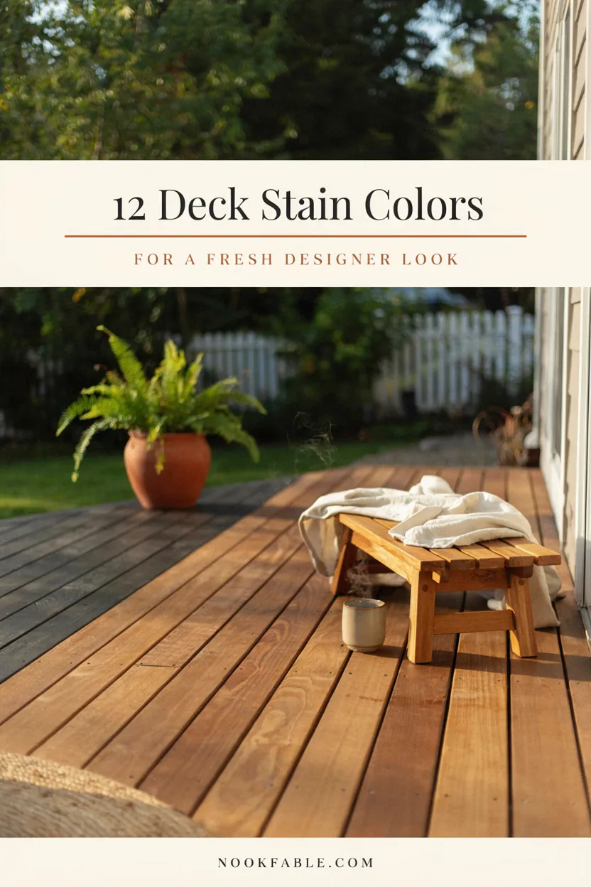
12 Deck Stain Colors That Give Old Decks a Fresh Designer Look
An old deck rarely needs replacing — it needs recoloring. Stain is the least expensive square-footage makeover in home improvement: forty dollars a gallon standing between gray, splintery boards and a surface that looks professionally rebuilt. The catch is that stain color is a bigger design decision than most weekend refinishers treat it as. The right tone flatters the house, hides the deck’s age, and sets the mood for every barbecue on it; the wrong one highlights each patched board and clashes with the siding for the next five years. These deck stain colors cover twelve looks that consistently deliver the designer effect — warm honeys and driftwood grays, confident darks, coastal washes, and one two-tone trick that reads custom-built. Each includes where it works, what it hides, and the transparency level that makes it succeed. Save your favorites, then test them on the deck’s most weathered corner before the whole weekend commitment. I have talked more clients out of replacing decks than into them — stain does the work.
1. Warm Honey Cedar, the Eternal Crowd-Pleaser
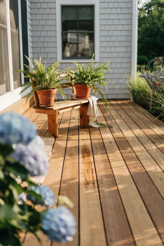
Honey cedar is what people picture when they imagine a beautiful deck: golden warmth, visible grain, the glow of new wood without the new-wood price. A semi-transparent formula in this range revives sun-grayed boards convincingly, reading fresh-built from the lawn while letting the timber’s character breathe through. It flatters every siding color and remains the safest gorgeous choice in the stain aisle.
Semi-transparent is the right transparency here — solid honey tones go orange and plasticky fast. Clean and brighten the deck first (a two-step deck wash, not just a rinse) or the gold turns muddy over gray wood. Two thin coats, back-brushed, beat one heavy pour. Expect a refresh every two to three sunny years; the recoat is an easy afternoon since color matches itself.
2. Driftwood Gray for the Aged-Perfectly Look
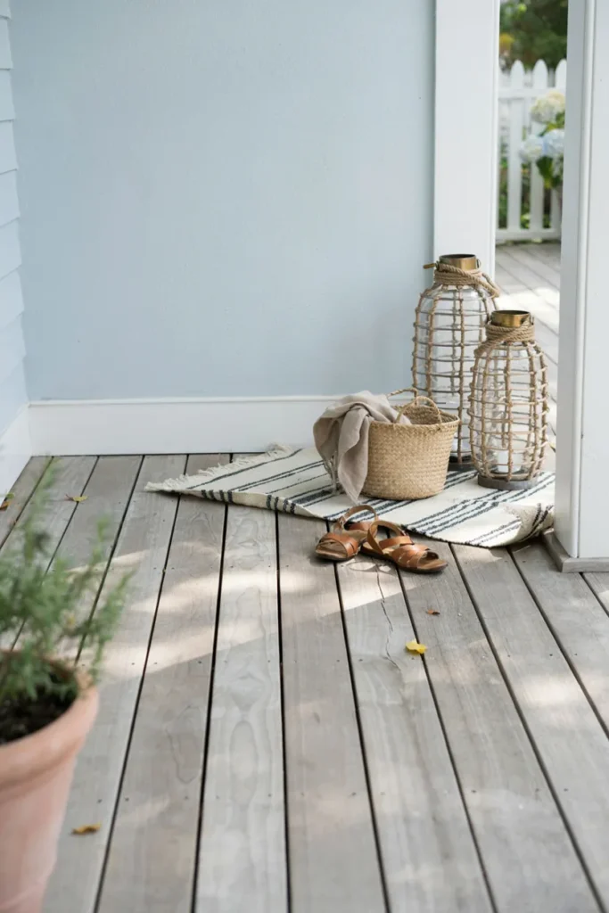
Weathered gray happens to every deck eventually — driftwood stain simply makes it look intentional. The silvery, beach-house tone delivers that decades-by-the-sea character in a single weekend, minus the splinters and blotch of genuine neglect. It pairs beautifully with white, blue, and gray houses, hides future graying better than any warm tone, and photographs like a coastal magazine spread year-round.
Semi-solid formulas give the most convincing driftwood — enough pigment to even out mismatched boards, enough transparency to keep wood texture alive. Cool grays lean modern; greiges with brown undertones stay softer against warm siding. This family is the lowest-regret choice for decks with lots of replaced boards, since gray unifies mixed wood ages like nothing else.
3. Soft Black That Makes Furniture Pop
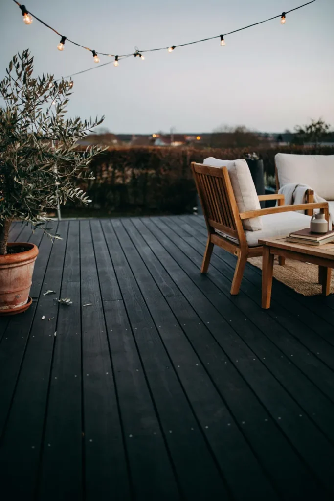
Designers keep staining floors black for one reason: everything standing on them suddenly matters. A soft-black deck recedes like a gallery floor, making teak furniture glow, greenery saturate, and cream cushions look editorial. It’s the boldest transformation an old deck can get — boards that once begged replacement become a sophisticated stage — and it hides stains, patches, and mismatched lumber completely.
Choose soft or brushed black rather than jet, in a solid stain with matte finish; gloss betrays every board flaw. Dark surfaces run hot in full summer sun, so this suits shaded and evening-use decks best — or plan the outdoor rug where bare feet land. Light furniture and abundant plants are mandatory partners; black plus empty reads abandoned, black plus styled reads five-star.
4. Espresso Walnut, Rich but Forgiving
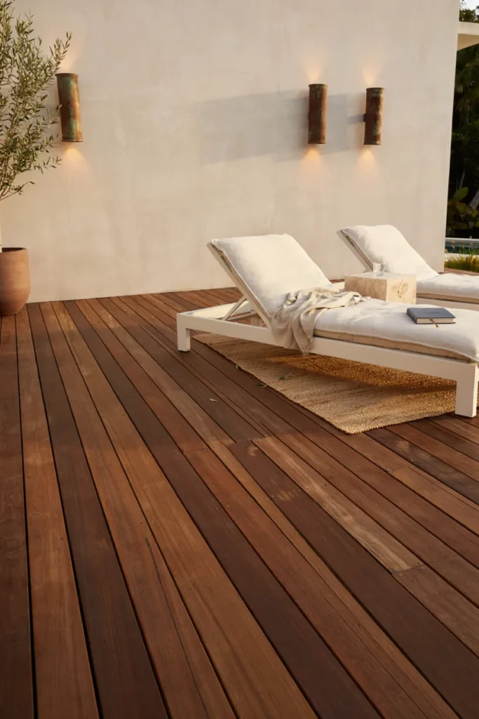
Espresso is black’s warmer, more forgiving cousin — deep chocolate-walnut that reads luxury veranda rather than modern statement. It grounds light-colored houses handsomely, disguises years of wear as depth, and flatters both wicker and metal furniture without demanding a styling commitment. For older decks with a history of patches and pet years, dark brown is the great equalizer.
Semi-solid espresso keeps a whisper of grain; solid versions read painted, which suits badly weathered boards. Warm undertones matter — chocolate-browns harmonize with most siding while cool taupe-browns can go muddy beside warm brick. Like all darks it shows pollen and dust between rains, so a soft push-broom becomes part of the coffee routine. The payoff photographs like a resort.
5. Slate Gray Solid, the Modern Neutral
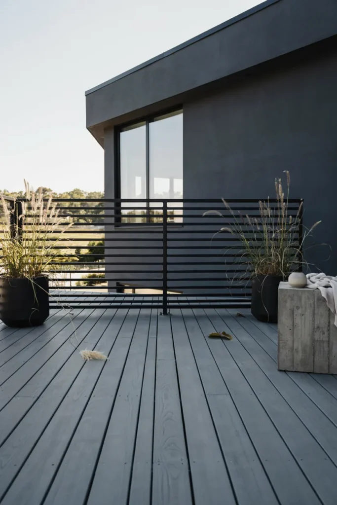
Slate gray is the deck color of contemporary architecture: a true mid-gray that reads as designed surface rather than wood pretending otherwise. Solid slate unifies decades of mixed boards into one clean plane, coordinates effortlessly with black frames and cool sidings, and gives furniture a neutral stage without black’s heat or drama. It’s the modern equivalent of what cedar tones were to the nineties.
Go solid here — the style’s crispness is the point — and pick grays against your siding in daylight, since undertones swing blue, green, and violet outdoors. Mid-tones hide dirt better than pale gray and heat less than charcoal. Refresh the high-traffic lanes every couple of seasons; solid stains wear by path, and slate makes touch-ups nearly invisible.
6. Redwood Revival for Classic Americana
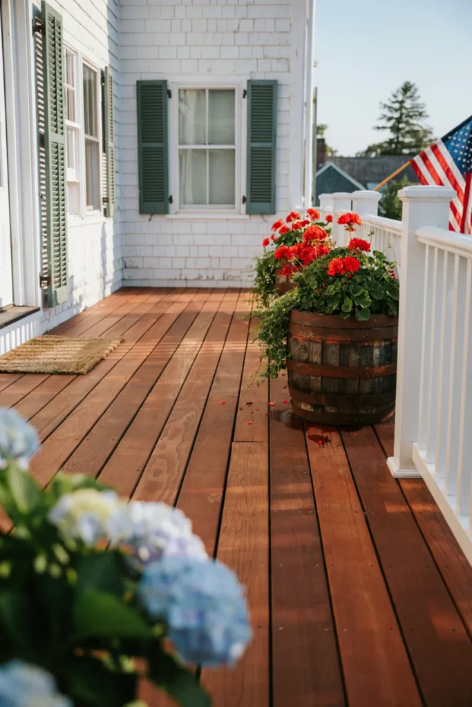
Redwood stain fell from fashion just long enough to come back charming: russet red-brown boards against white railings, geraniums in barrels, the whole summer-cookout postcard. On traditional homes — colonials, capes, farmhouses with shutters — the warm red reads heritage rather than dated, and it makes green landscaping pop the way only complementary colors can.
Keep it in the brown-red family; bright orange-reds are what dated the look originally. Semi-transparent over decent boards preserves the classic glow, semi-solid rescues rougher decks. White or black railings frame it best — matching red railings tip into monotone. Pairs beautifully with brick homes too, echoing the masonry a few steps warmer.
7. Greige, the Diplomat of Deck Colors
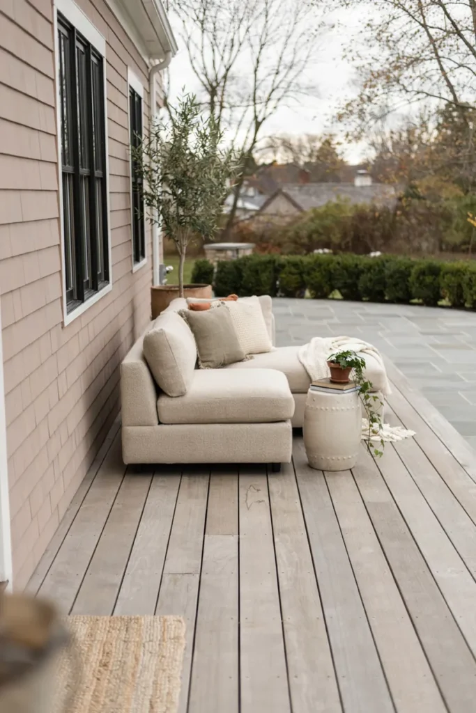
When the house is warm-toned but gray feels right, greige negotiates the peace. The gray-beige hybrid picks up both stone and wood tones around it, coordinating with almost any siding while keeping the current neutral sensibility. It’s the color consultants reach for when a deck must connect mismatched elements — tan house, gray pavers, brown fence — into one yard that finally agrees.
Solid greige delivers the smoothest modern read; semi-solid keeps some grain for transitional homes. Test generously — greige is undertone theater, shifting pink, green, or gray by the hour, so watch samples through a full day. Style with layered neutrals and one olive or terracotta accent. Of every color here, greige hides dust, pollen, and paw prints most gracefully.
8. Whitewash for Coastal Brightness
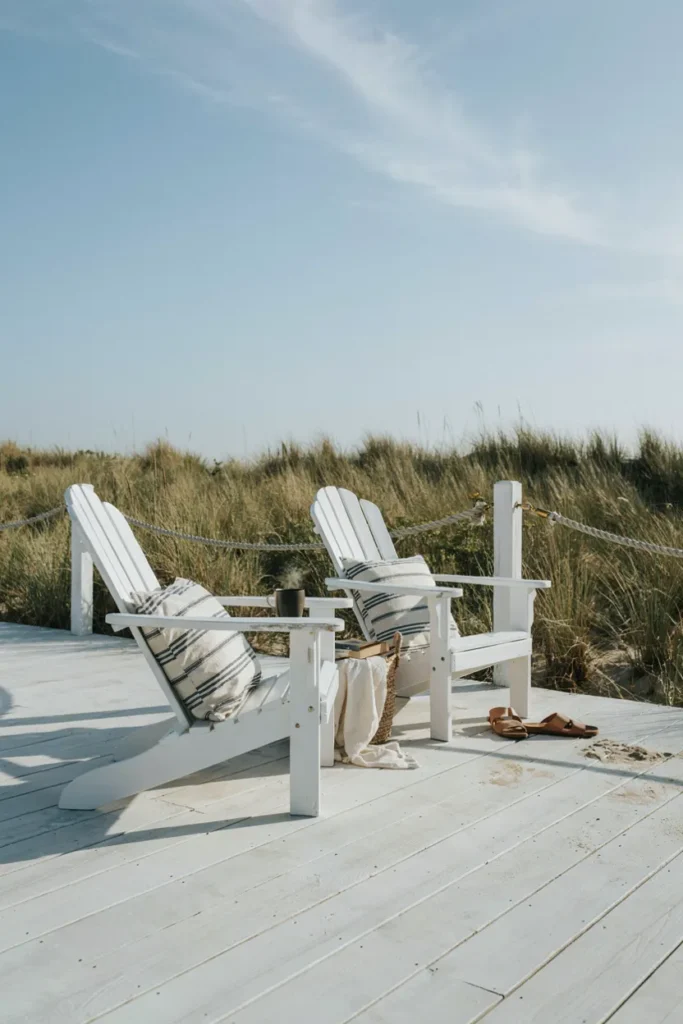
A whitewashed deck is summer distilled: pale boards bouncing light, grain ghosting through the wash, everything on it looking like a vacation photo. The brightening effect visually doubles small, shaded decks, and the sun-bleached softness suits coastal, cottage, and Scandinavian palettes equally. Where dark stains absorb heat, whitewash reflects it — bare feet notice by July.
Use a white semi-transparent stain or dedicated whitewash formula, never straight paint, so grain stays visible and flaking stays impossible. It shows dirt honestly — this is a broom-friendly household’s color — and prefers decks without heavy tree litter. Navy, stripe, and natural rope styling completes the shoreline; one coat reads Scandinavian, two reads Hamptons.
9. Olive-Sage, the Earthy Surprise
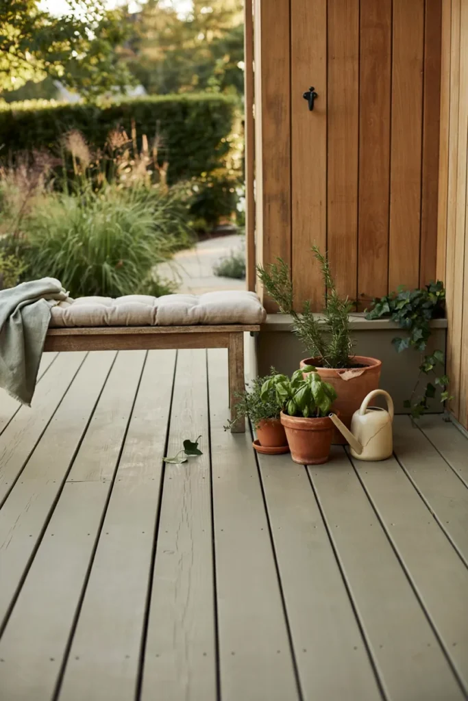
Nobody expects a green deck until they see one done well. Muted olive-sage — gray-green, deeply earthy — dissolves the boundary between deck and garden, making the platform read as part of the landscape rather than an object parked on it. Against cedar tones, terracotta, and abundant planting, it’s the choice that gets asked about at every gathering.
Keep the green heavily muted; anything minty or grassy fights actual foliage and loses. Solid stain gives the tone its velvety consistency. Pair with natural wood furniture, clay pots, and cream textiles — the palette is practically pre-styled by the garden itself. Best on homes in earth tones; against stark white or cool gray siding, test twice before trusting.
10. The Two-Tone Border Trick
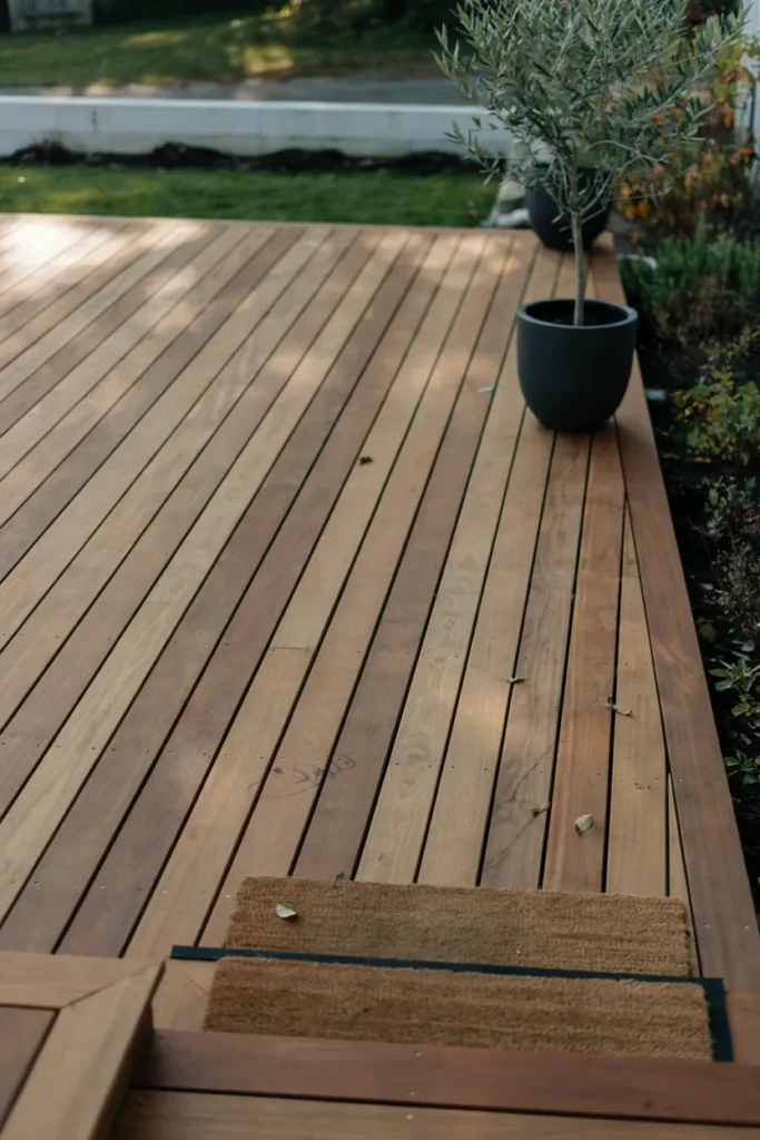
One stain color refreshes a deck; two colors redesign it. Staining the perimeter boards dark around a lighter field — espresso frame, honey center — outlines the deck like a picture frame, visually straightens tired edges, and reads unmistakably custom. The border also marks stair edges for night safety, which is the rare designer flourish that doubles as a code-inspector compliment.
Map the border two boards wide along every edge and step nose, tape the transition line, and stain darks first. The two tones should share undertone temperature — warm with warm — and at least two shades of contrast. Where decking direction changes at the border, the effect strengthens. Costs one extra quart and one careful hour; reads like a rebuild.
11. Navy-Charcoal for Cool Drama
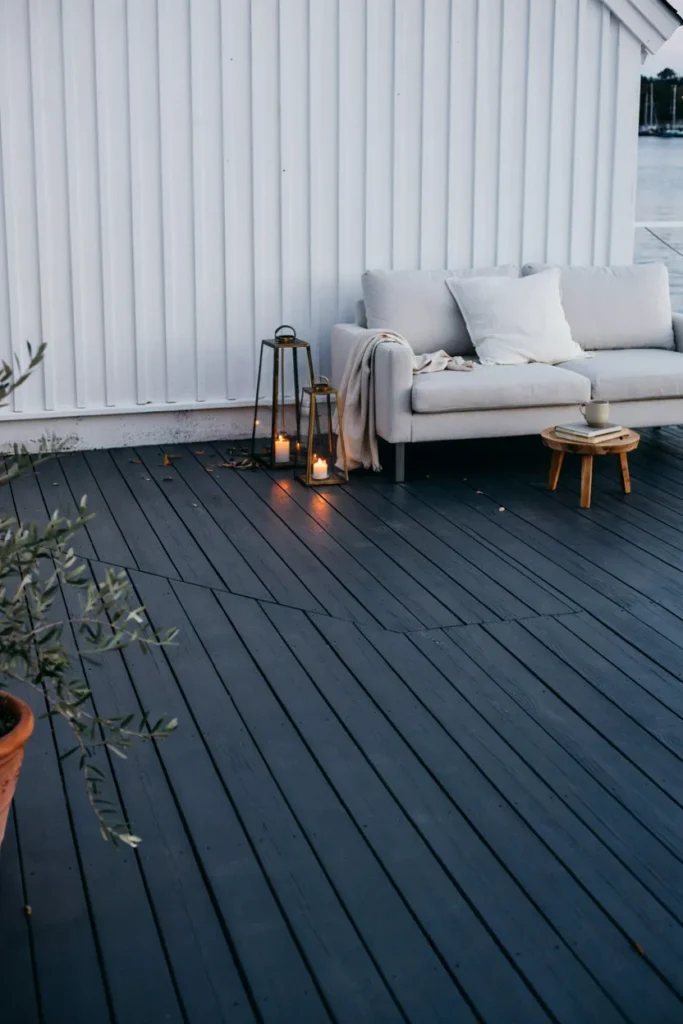
Between black’s severity and gray’s safety sits navy-charcoal — a blue-black that reads sophisticated in daylight and reveals its indigo depth at dusk. Against white or pale gray houses it delivers crisp nautical-modern drama, flattering brass hardware and pale furniture like an evening suit. It’s the dark deck for people who found true black one step too far.
Solid stain preserves the color’s depth; choose versions labeled charcoal-navy over bright marine blues, which read playground outdoors. White trim or railing sharpens the scheme, brass and copper accents warm it. Like all darks it prefers shade or evening decks and rewards regular sweeping. With white siding, it’s the highest-contrast combination this list offers.
12. Clear-Coat Confidence for Beautiful Boards
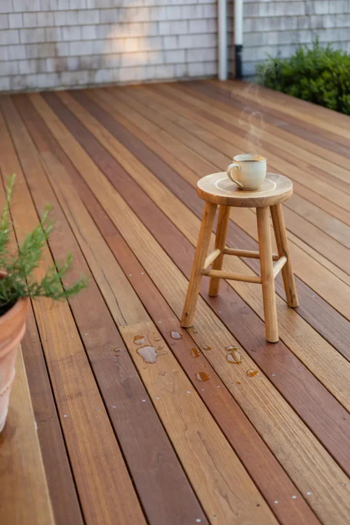
Sometimes the designer move is restraint: if the boards underneath are genuinely handsome — tight cedar grain, rich redwood, well-aged hardwood — a clear penetrating sealer celebrates instead of covering. The wood’s true face stays visible, water beads off, and the deck reads honest and crafted in a way no pigment replicates. Purists consider everything else a compromise.
Understand the trade: clear finishes carry the least UV protection, so expect annual recoating in sunny exposures — the price of transparency. Choose a penetrating oil-based sealer with UV inhibitors over film-forming varnish, which peels theatrically outdoors. A wash and light sand first lets the sealer bite. If year-one graying appears anyway, every tinted option above remains open; clear burns no bridges.
Conclusion
Stain is proof that transformation doesn’t bill by the square foot. The same tired boards read farmhouse in honey, modern in slate, resort in espresso, and seaside in driftwood — the deck stain colors around them do the renovating. The decision rules stay constant across all twelve: match undertones to the house, choose transparency by the wood’s condition (better boards earn more show-through), and always test on the most weathered corner, watched morning to evening, before committing the sprayer. Prep decides the outcome as much as pigment; a cleaned, brightened deck takes any color like new wood. Save your favorite tones to your Pinterest boards next to photos of your actual house — seeing them side by side settles most debates instantly. Then pick the weekend, pick the color, and give the old deck its second opening night. The furniture, the ferns, and the barbecue guests will all perform better on a stage that finally looks designed. While the stain cures, plan the base too — these deck skirting ideas finish the deck from the ground up.